REDUCING BOUNCE AND BRINGING RESERVATIONS ON-SITE
DisneySprings.com had a 90% bounce rate and sent guests off-site for reservations. I led the IA and content rebuild, reducing bounce to under 65% and increasing dining reservations by 23%.
From a top-level overview that lost guests to OpenTable, to an editorial homepage with discovery and reservations built in.
The redesign at a glance. The before page sent guests into the site with no internal pathways. The after page is a series of pathways (venues, openings, stories) with reservations and discovery built in.
The Opportunity
A high-traffic site that wasn't supporting discovery or booking
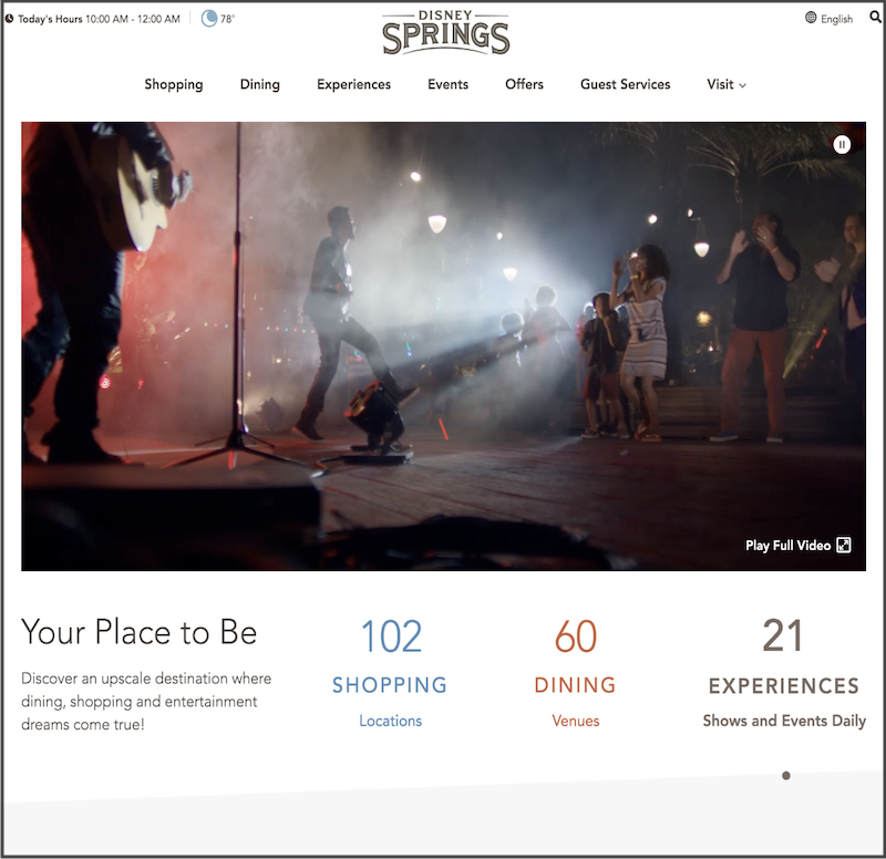
Disney Springs is a large outdoor complex at Walt Disney World, with more than 180 venues across shopping, dining, and experiences. The website is the primary planning tool guests use to decide where to go, both before their visit and on-site.
The site wasn't supporting that behavior. It had a 90% bounce rate, and every dining reservation sent guests off-site to OpenTable. Even when guests found what they were looking for, they left the site to complete the action. Pages didn't connect to each other, and navigation couldn't support browsing across a complex of this size.
The opportunity was to redesign the site and rebuild the information architecture so guests could explore the full breadth of the complex, move between pages, and book reservations without leaving.
What I Led
Rebuilding how guests discover and book across the site
I led the information architecture and content strategy for the relaunch, working closely with Product, Design, Engineering, and Guest Experience teams. The work covered diagnosis, structure, and content direction.
What I owned
- Content audit and inventory of the existing site, mapping pages, assets, and how people were engaging with them.
- Analysis of behavior data to understand the drivers behind the 90% bounce rate.
- Site map and user flows to define how guests move through the experience.
- Taxonomy, navigation, and search structure for a complex with hundreds of venues.
- Direction for the copy team to align content with user needs and site goals.
Built in partnership
- Wireframes developed with Product Designers to test content placement and navigation.
- Moving reservations in-site, in partnership with Product and Engineering, to remove the OpenTable handoff.
- Faceted search and filtering, refined with Product Designers and validated against guest behavior.
Approach & Key Decisions
Bounce was an architecture problem, not a content problem
A 90% bounce rate looks like a content problem. The instinct is to rewrite headlines or improve imagery. But the audit and behavior data pointed elsewhere. The issue wasn't content quality, it was architecture.
Three patterns explained the problem. First, every dining reservation sent users to OpenTable, and they didn't return. Second, there were almost no internal links between pages, so most pages functioned as exits. Third, navigation and search couldn't surface the scale of the complex, so guests who didn't already know what they wanted dropped off.
The solution was architectural. Bring reservations in-site. Build faceted search and filtering to support a large venue set. Add internal linking and recommendations so pages connected instead of ending.
Content still mattered, and the copy team updated and rewrote key pages for the relaunch. But the biggest gains came from structure. Better copy wouldn't have changed outcomes if every path still led off-site.
A 25-point drop, achieved by treating the bounce as a structural problem and fixing the three architectural reasons guests were leaving.
Impact
Systemic impact
- Reframed the relaunch around behavior data, using site maps and user flows as shared alignment artifacts.
- Replaced external reservation flows with in-site booking, removing a major source of drop-off.
- Introduced a taxonomy and faceted search system that made a large venue set discoverable without prior knowledge.
- Added internal linking and recommendation patterns so pages connected instead of ending.
- Established an IA foundation that continued to support the site after launch.
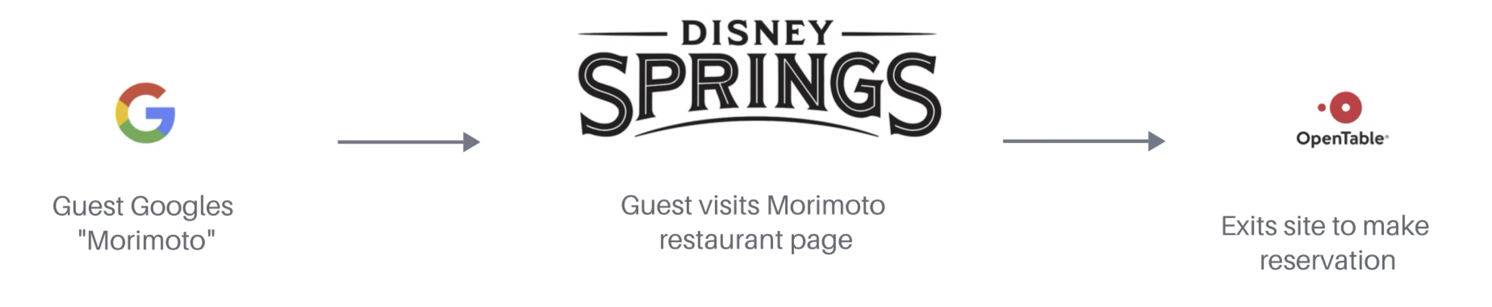
The diagnostic: bounce was driven by a structural handoff
A clear pattern emerged in the dining flow. Guests often arrived via Google on a specific restaurant page, then left the site to complete a reservation on OpenTable. The Disney Springs page functioned as a stopover rather than a place to continue exploring.
Once guests left the site, they rarely returned to browse other venues. Across dozens of restaurants and search-driven visits, this pattern accounted for a significant share of exits and shaped the overall bounce rate.
Bringing reservations in-site
We moved away from sending guests to OpenTable and brought reservations directly into Disney Springs, on the same pages where guests were already deciding where to eat. This required alignment with Engineering and Product on feasibility, but the IA case was clear: any page that sends a user off-site to complete a core action is a page that loses momentum.
With reservations in-site, dining pages became decision and booking surfaces instead of informational stopovers. After launch, dining reservations increased 23% relative to walk-ins.
Faceted discovery for a sprawling complex
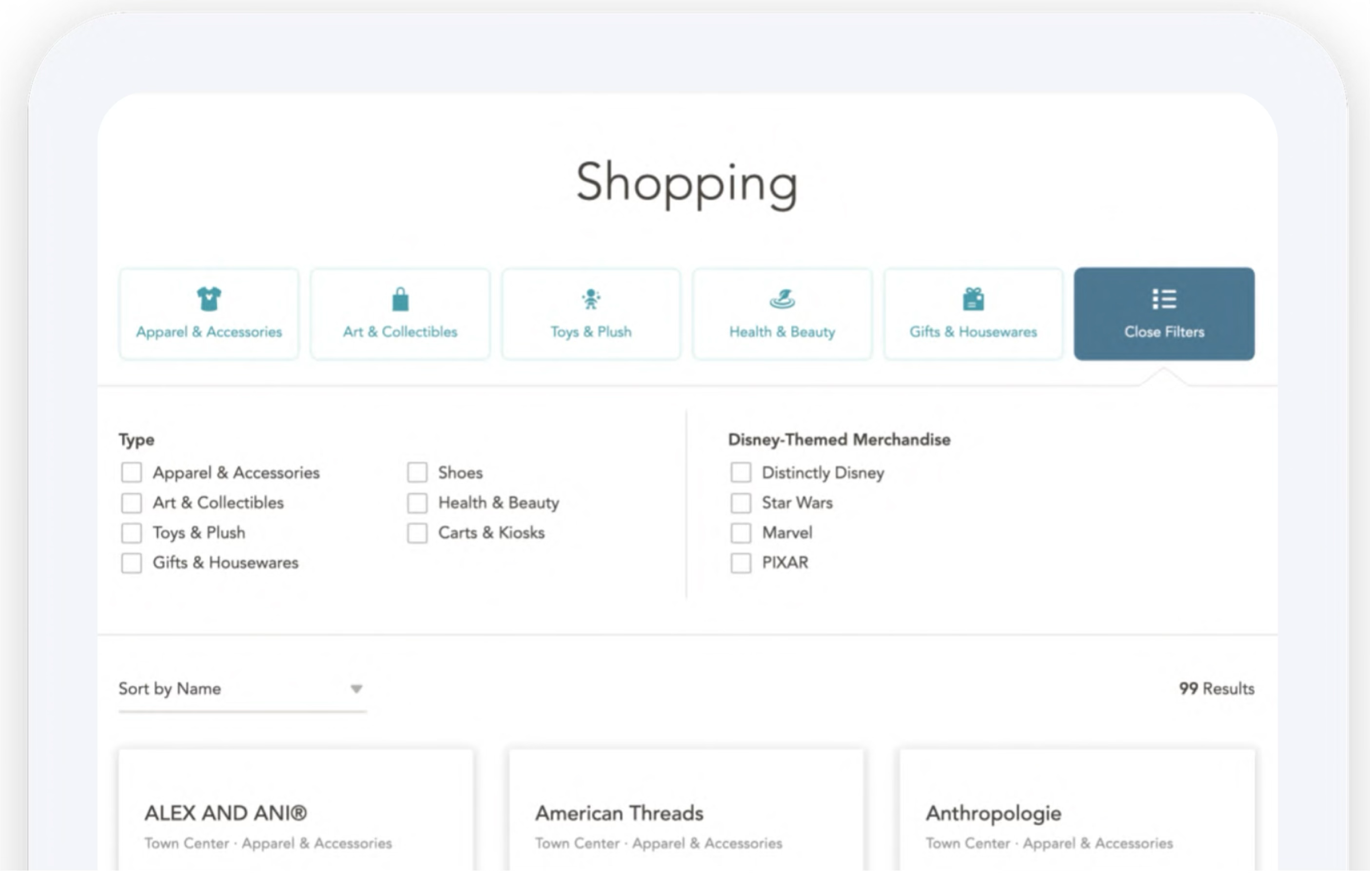
With more than 100 shopping locations alone, the original navigation couldn't support how guests needed to browse. Guests who already knew what they were looking for could find it. Guests who wanted to explore couldn't.
I focused on structuring the taxonomy and filters so the full range of options was easier to navigate. Shoppers could filter by category (apparel, art, toys, health and beauty), by brand themes (Disney, Star Wars, Marvel, Pixar), or by location within the complex. The same approach extended to dining and experiences. Each filter combination returned a meaningful set of results rather than an empty or unhelpful view.
Internal linking to support continued exploration
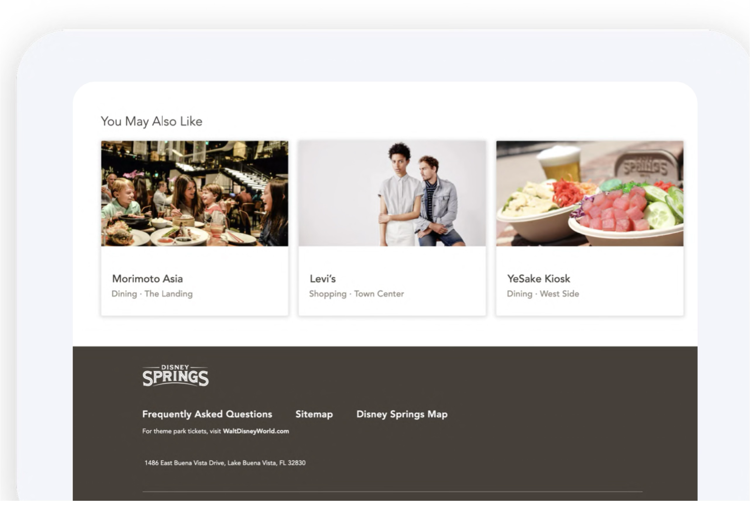
Even with reservations in-site and search improved, guests often still reached a point where there was nowhere obvious to go next. The original site had very few internal links, so most pages effectively ended the journey.
The new IA introduced recommendation modules and contextual links to keep guests moving through the experience. This included "You May Also Like" sections on venue pages, links within editorial content, and cross-category suggestions that connected dining, shopping, and experiences.
These weren't decorative additions. They were designed to create natural next steps so guests could continue exploring the site instead of leaving it.